=cities =architecture
There are some basic principles for aesthetics of buildings, such
as:
1) bilateral or radial symmetry is good
2) visible detail is good,
if the detail is acceptable on its own
3) theme in what a building looks
sort of like is good
4) certain colors go well together
5) bases
shouldn't be too narrow relative to height
Recently, architecture has
somehow managed to ignore these kinds of principles.
Today, a common type
of tall building is the rectangular glass box. From a distance, the windows
blend together into a homogeneous surface, perhaps with reflections or lights
that appear basically random. This mainly violates (2) and (5). Here are
examples at day and night:


Now let's add some visible detail, and
make the base wider.

The Empire State Building is generally liked,
but I consider it only barely acceptable. To me, the Cathedral of Learning is a
better example of this principle.

But of course, a building
exists within its environment, and should also match it thematically. Look at how
this cathedral in Reims stands out:

It also has a bunch of detail
(like the statues) that's too high up to see well, which acts more like
visual noise than art. And of course, it costs money to have fancy detail like
old Gothic cathedrals.

Sheet glass is cheap these days, and
people like windows. So in some ways it makes sense to have everything be
window. But even if you're going to have glass everywhere, it's basically the
same cost to have colored and/or sandblasted windows in some artistic pattern.
Glass mosaics on
concrete are also, of course, possible. Today, CNC machines could place the
tiles automatically, if people cared to do that.
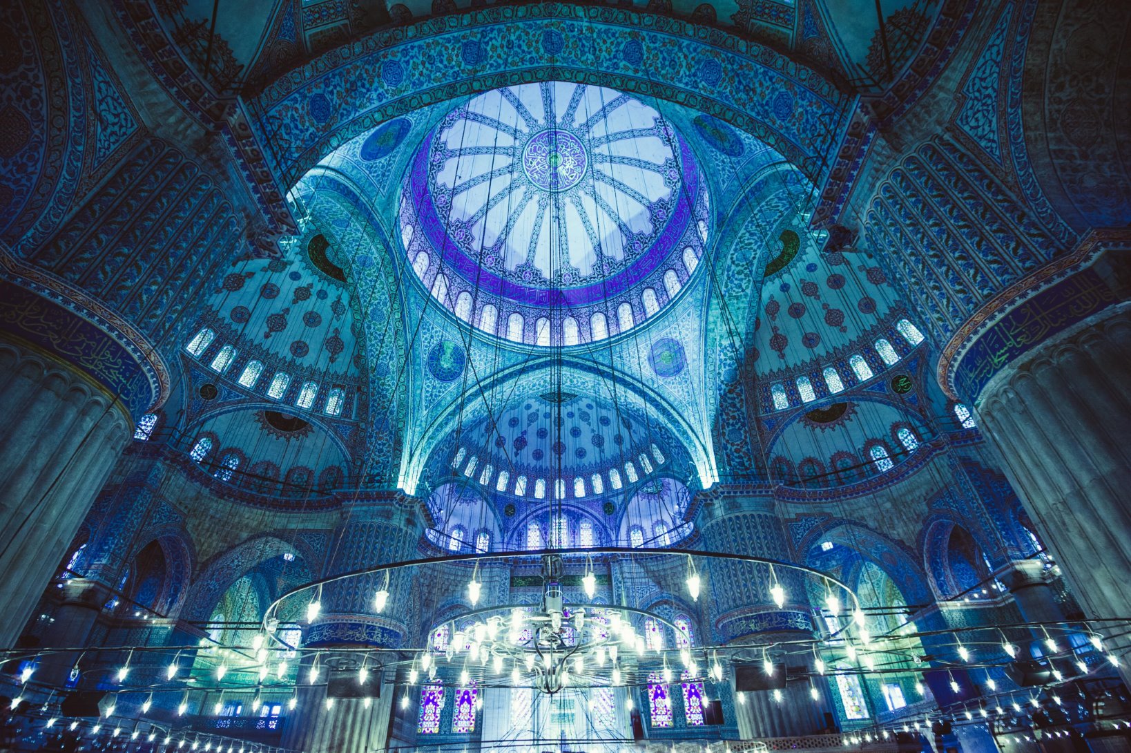
Personally, I think a
lot of mosques manage to violate (2) and (4) by focusing too much on fine detail
everywhere, creating texture with no higher-level pattern or coordination. But
for examples of glass mosaics, it's hard to beat mosques. Here's the Blue
Mosque:
Of
course, it would be more expensive to make mosaics or organic shapes than to
make a box with cast concrete floors and dropped tile ceilings. OK, so we're
compromising on aesthetics to use modern construction technology, which is why
space is so cheap today...wait, it's not cheap at all! Where's all the money
going?
The answer is, it's going to some combination of real estate
developers with connections, politicians the real estate developers have
connections to, (sometimes) construction worker unions, and people who owned
land that increased in value.
When you see a weird looking large
building, in many cases it looks weird because its "architectural significance"
is an excuse for giving permission to build it to a certain real estate
developer. Because of fixed costs for foundations, crane setup, etc, it's
usually slightly cheaper (per floor area) to make 25-floor buildings than
5-floor buildings. So, if land is expensive, permission to build a tall building
when everyone else is limited to 5 floors could be worth $100 million. (This is
one reason I'm focusing so much on tall buildings when shorter buildings are
more common; another is that tall buildings are obviously more visible.)
Anyway, to me, arguments about aesthetics being too expensive seem a bit
silly when people go and build stuff like this:

In some ways, lots of plain, boring, identical buildings are a good sign about local governance: that means that local officials actually approve projects designed for optimum economic efficiency. For example, these identical Hong Kong apartments:

But the fact is, if people have to look at your building, then that's an externality (which can be positive!) so government should say something about it. But because building owners don't have to care about the happiness of people looking at their building, you get advertisements on building wraps.

But things can be worse than libertarian
officials that don't care about aesthetics. You could have officials with bad
taste. Behold, the Boston city hall:

Now, most people dislike it,
but some people (including
many architects) really like that kind of Brutalist
architecture. So if you're wondering why people don't use older architectural
styles instead of Brutalism, the answer is often that they just didn't want
to. Why is that? I've talked to a number of them, and come to the
conclusion that they're all lying, usually to themselves. Love of Brutalist
architecture is mainly countersignalling against normal aesthetics, pretending
to have transcended the "basic" principles that plebeians like. But it's also,
sometimes, a way of declaring oneself a modern Big City Human who loves concrete
and doesn't need obsolete junk like trees. In other words, a way of saying, "I,
for one, welcome our hyper-capitalism inhuman institutional overlords! I'm
content! I'm still useful!"
Well, I guess one does
what one must to get by psychologically in the modern world.
To be fair, those ugly vertical
concrete slabs in front of windows that you see on many Brutalist buildings do
have a purpose: they're supposed to block direct sunlight, providing diffuse
reflected light instead. To continue to be fair, they block the view out from
inside, and the same thing could be accomplished by sandblasted glass,
pagoda-type roofs, or, you know, curtains.
If you're wondering what using
horizontal instead of vertical concrete would look like, well, here's the V&A
Dundee.

Things can go badly in the opposite direction of Brutalism, too. For example, the Portland Building was somehow considered an "architectural milestone".

To be clear, I'm not against color. To me, the "white marble aesthetic = class" is blind imitation of high-status imitation of Renaissance imitations of ancient Greek stuff, which actually had paint on it that just wore off over time. Those Greek statues actually looked more like this:

Looks cheap and low-class, right? Well, there's nothing wrong
with aesthetics based on imitation, and there's no real difference between
imitating something imagined and creativity. Working with unpainted marble
didn't make, say, Antonio Canova or Francesco Queirolo bad artists. But color is
a tool, and while it's better to eschew tools as unnecessary than to use them
poorly, it's best to use every appropriate available tool well.
Well,
let's talk about using what you have, then. Here's the inside of an Intel
office building:

I've seen multiple such areas
myself, and I have several problems with them:
1) No offices. Workers
are alone, yet they can't have conversations without bothering nearby
people. Having people walking behind your back all the time is also
something that many folks find distracting and stressful. I think 3-person
offices are the way to go, usually.
2) It's a big room with a low
ceiling. That's bad; ceiling height should be proportional to room height.
If you can't raise the ceiling, then make the room smaller.
3) White
dropped-ceiling tiles everywhere. Why not have a mosaic? It would even help
people navigate if the ceiling had some variation.
4) There are no
nearby windows. That's because the building is big. Why is the building big?
Because Intel is a big company, so they wanted a big building. But of course
that's just completely pointless.
5) Fluorescent lights. LED lights
weren't practical at the time, but they could have used metal halide lamps
reflected off the ceiling.
I could go on, but really, isn't that
enough?